UI Design • 2022
SMAN 27 Jakarta
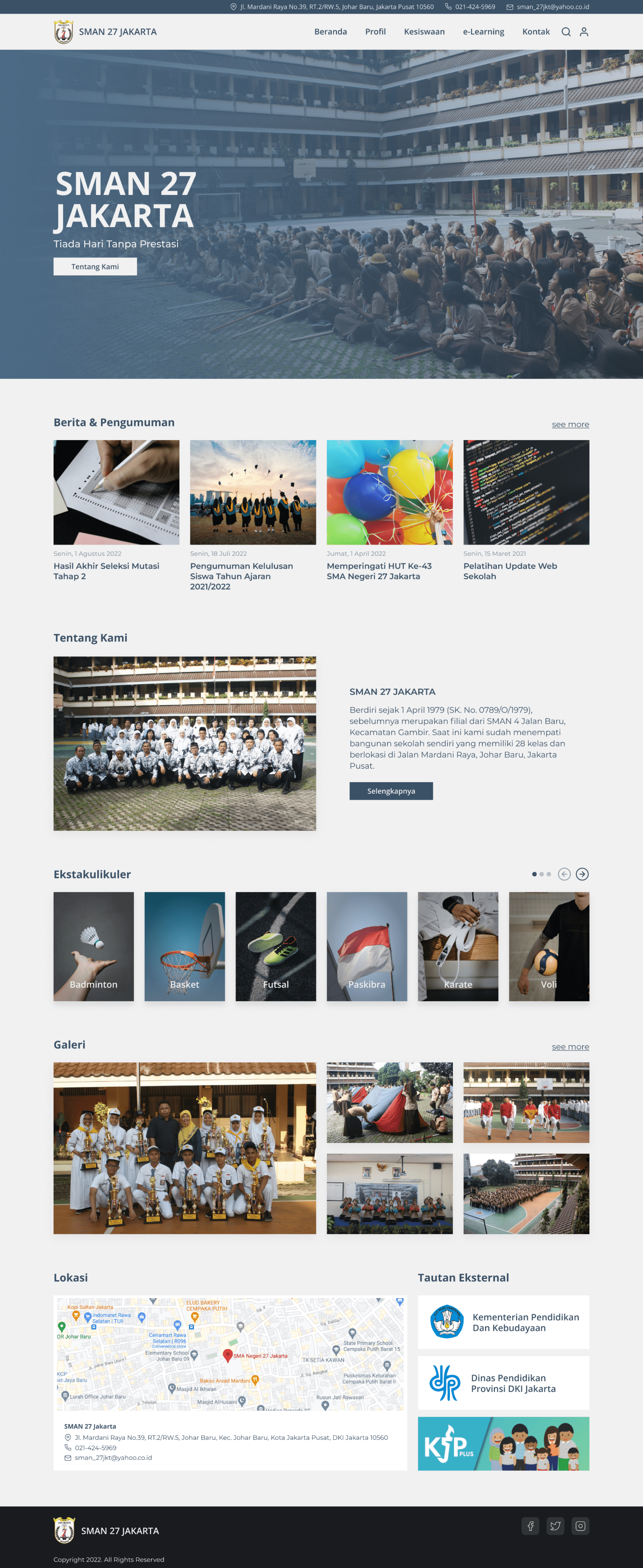
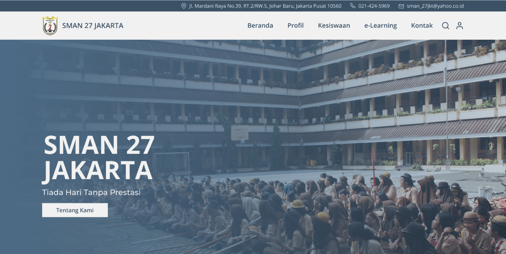
Redesign School Site (Homepage)
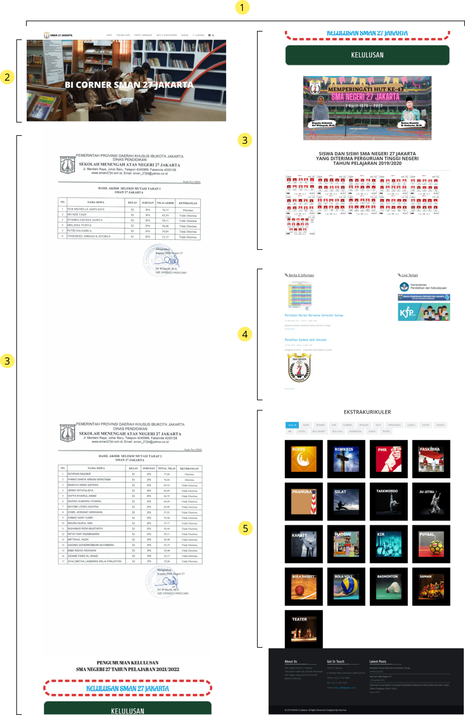
Maybe because of using less appropriate templates, the structure of the homepage looks not good enough, as well as poor use of white space
Hero section image and text need more contrast
Infographics and banners can be included in the news and announcements section to make page simple
I think better placing news and accouncement section on top page
Too much information to display and the use of the filter button makes it look messy
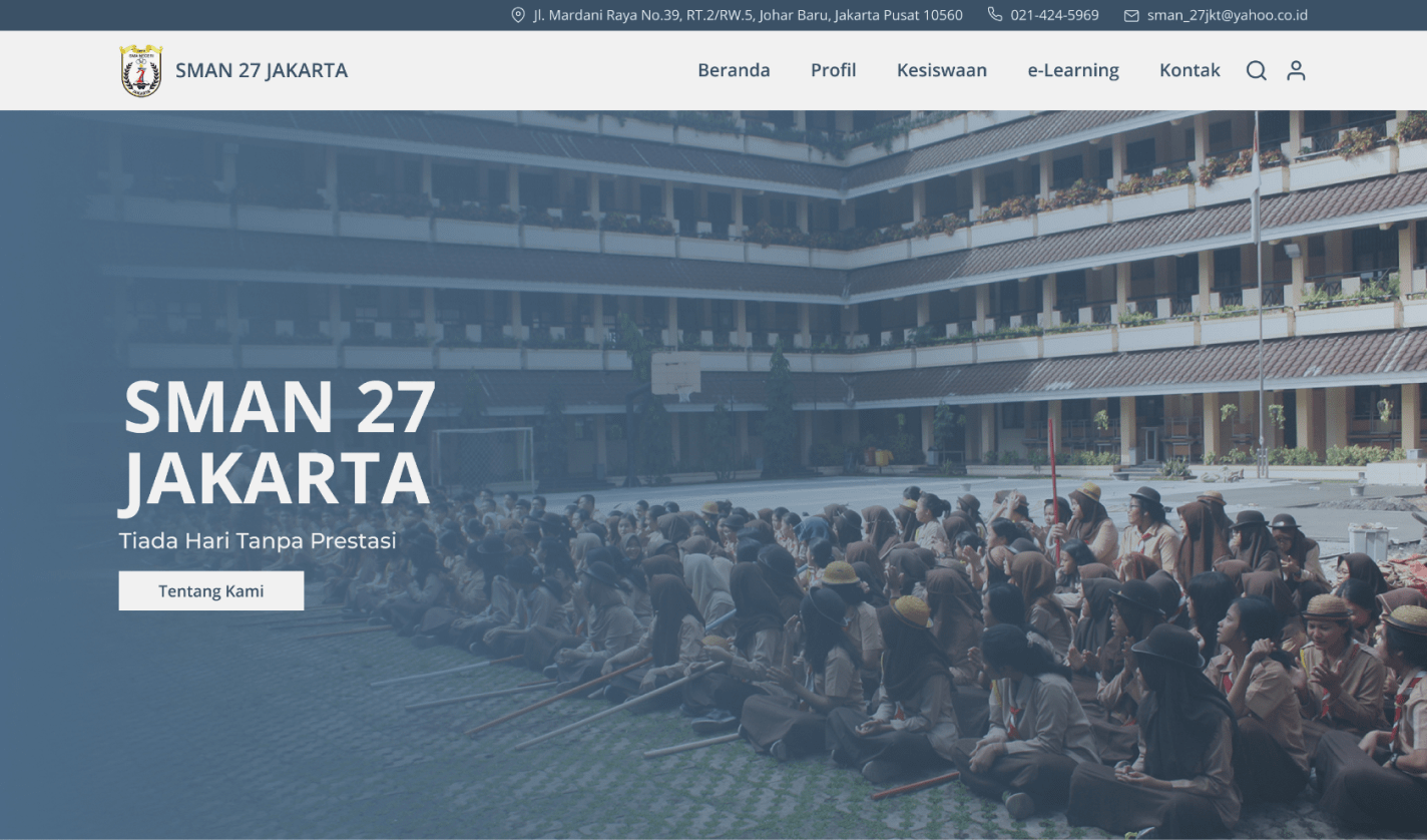
I use an image with overlay to make text more readable
Adding dark bluish-gray for primary color so the page doesn't look flat. I use a dark bluish-gray color because it's close to the color of the high school uniform pants in Indonesia
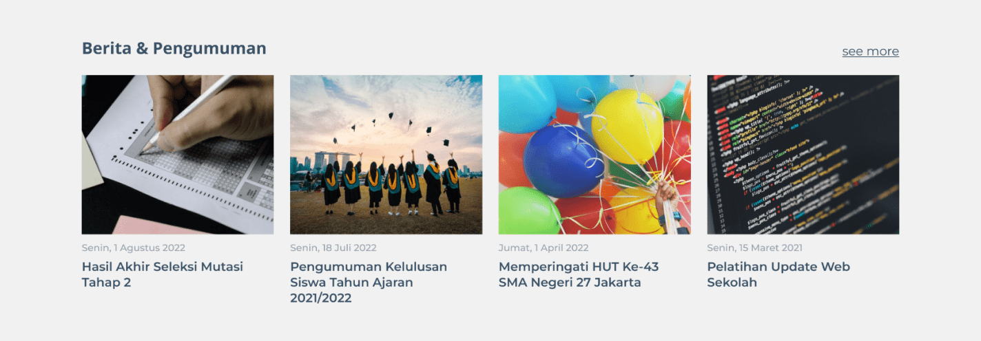
Combining news section with announcement section and since its usually contains important information, i put it on upper page
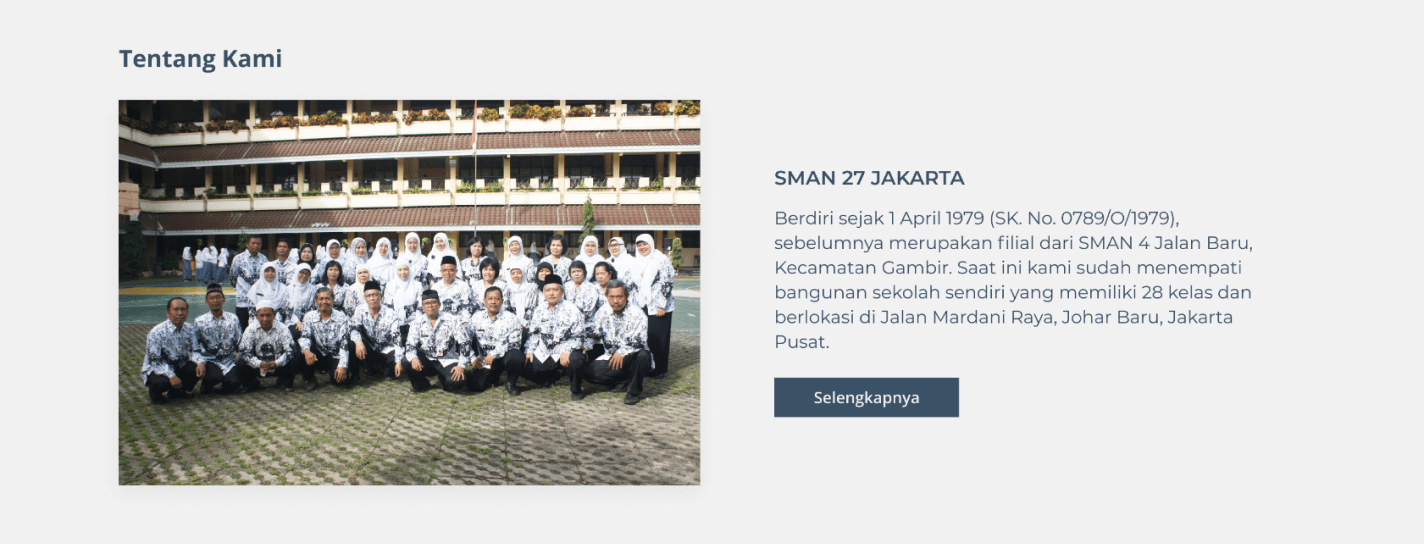
Adding About us to introduce the school
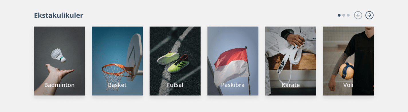
Limiting information about extracurricular activities to six so the information not overload
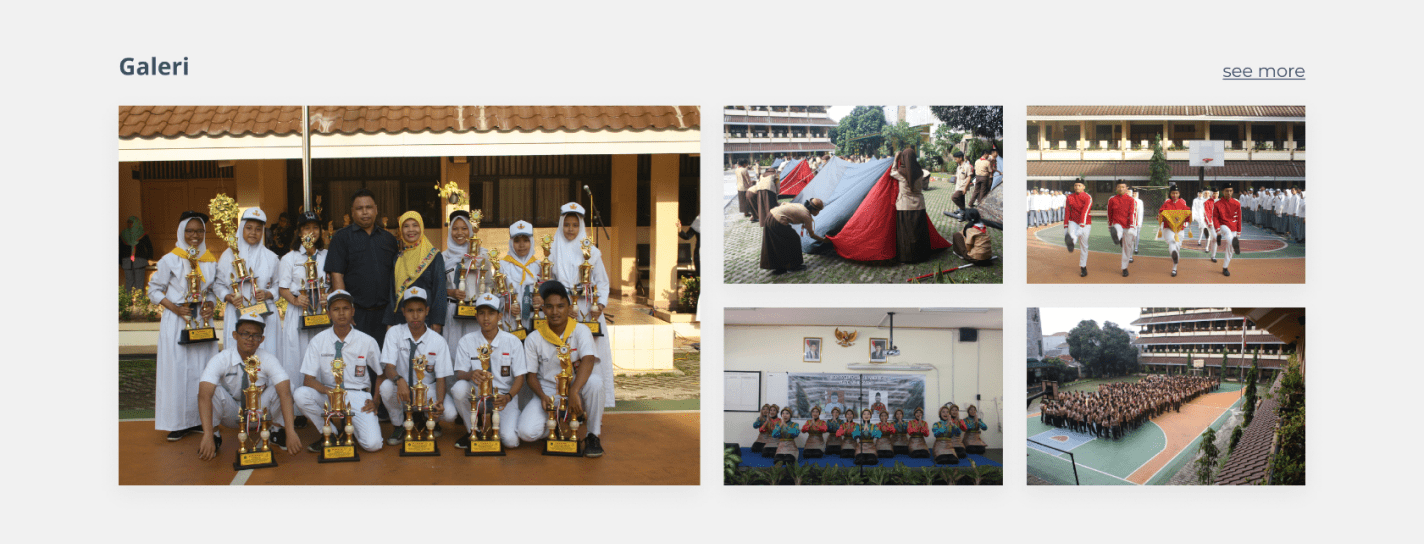
Adding galery section to display school activities as well as achievements made by the school
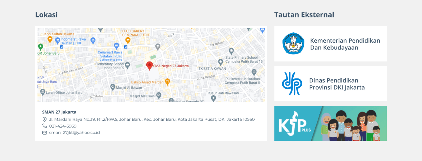
Adding school contact address and location that linked to gmaps Keep external link on the page because it is related to government programs and the provincial education office